UPDATE 28 April 2010 : This subject is revisited in relation to Flex 4 spark components, here.
The problem: In Flex, how to overlay the video with something (e.g. a logo or caption) and keep the overlay relative to a corner of the actual video rectangle. Sounds like it should be a simple matter of creating a container and layering in the VideoDisplay instance and the over lay instance ? But…
In each of the following samples:
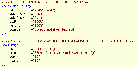
Video Display overlay Sample 1
In our first sample we simply place our overlay image using attributes ‘top’ and ‘right’ to keep the overlay’s top-right corner to 10px in from the VideoDisplay top-right corner.
It basically looks fine until you hit the play button and start resizing the panel.
As you can see the actual video within the VideoDisplay is constrained by its rectangle and depending on the differing aspect ratios, there will either be black space at the sides or the top, and our overlay is faithfully anchored to top right corner of the VideoDisplay and looks odd unless the aspect ratios are equal.
So how to solve this?
Looking at the documentation for VideoDisplay, there are many width and height properties to play with, however none of these relate to the current width and height or position of the contained video rectangle. You might think while looking at the documentation that the videoWidth and videoHeight properties might give the values we are after, but not so. They only return the ‘original’ width and height of the loaded video.
Fortunately the OpenSource nature of the Flex SDK and the magic of, holding the command key on a Mac (control key on a PC) with the cursor over the <mx:VideoDisplay> opening tag, then clicking it as it underlines, (using in Flash Builder or Flex Builder) will open the source for the VideoDisplay component within a new editor. Browsing through the code you will see at line 198:
mx_internal var videoPlayer:VideoPlayer = null;
It is this videoPlayer instance who’s properties we need to monitor to calculate our overlay’s position. The instance is not generally exposed through the VideoDisplay component’s api. Nor is it documented. However since it has been placed in the mx_internal name space, we can actually access it with namespace notation…
videoDisplay.mx_internal::videoPlayer.attribute
Where we replace ‘attribute’ with the property name we are after, so the following would be of use to us…
videoDisplay.mx_internal::videoPlayer.x
videoDisplay.mx_internal::videoPlayer.y
videoDisplay.mx_internal::videoPlayer.width
videoDisplay.mx_internal::videoPlayer.height
Video Display overlay Sample 2
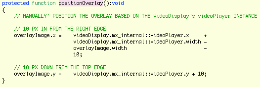
In this second sample, we create a positionOverlay method and call it from the resize event of the VideoDisplay component. Within positionOverlay we use the name space notation to get the videoPlayer properties and use some basic maths to reposition our overlay based on the top-right corner of the videoPlayer instance rather than the videoDisplay instance.
Additionally we call positionOverlay from our applicationComplete handler to set the initial position.
This basically seems ok, but play with it for a while and it is clear that something is wrong…
- Resizing slowly, seems ok
- Resizing quickly, and there seems to be some lag in the position of the overlay
- Release the resize handle while resizing quickly and the overlay can be left behind in completely the wrong place
Having traced the videoPlayer instance properties from within the positionOverlay handler, it is apparent that while the videoDisplay properties are correct, the videoPlayer properties are as they were previously. i.e. as they were rather than as they shall be.
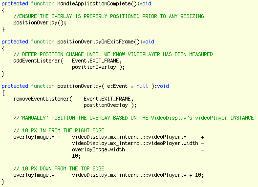
Video Display overlay Sample 3 – This one works properly!
This is where Player version 10 comes in. It added Event.EXIT_FRAME. (If your project targets a player older than 10, you will not see this event in your code assist.) If we use the exit frame event to defer the call to overlayPosition, we can then get measured values from videoPlayer and correctly position the overlay.
To do this I have created a new method positionOverlayOnExitFrame who’s job is to add an EXIT_FRAME listener who’s handler will be overlayPosition. The first job of which is to remove the listener, so that it only gets called once. By using a listener we need to change the interface of overlayPosition to accept an Event argument. But we are not interested in the event information and we still wish to call positionOverlay directly, so we have allowed the argument to have a null default.
Playing with the resize handle now, no-matter how quickly it is moved, shows no lag, and always drops in the correct place.
Finally, just to re-iterate, source code zip for these examples is here.
Note: These samples were built against Flex SDK version 3.4.
Note: I haven’t found any official documentation relating to when Event.EXIT_FRAME arrived in the player runtime. The Flash CS4 documentation for Event.EXIT_FRAME indicates player 9. However unless you target player 10 in Flex/Flash Builder, you will get compile errors. If anyone has accurate references, please post to the comments – thanks.
Note: When you look at the source view, it appears ragged. This is because in creating the HTML, Flash builder simply converts tab characters to four space characters. Clearly not every tab in my code actually represents 4 characters and therefore what should look like neat columns becomes ragged. I have filed a bug/enhancement request. If you too would like this fixed, feel free to add your vote to FB-23060.


 good for filling in the gaps.